Imagine you go to a restaurant for dinner and order a delicious dish from the menu. The chef prepares it with utmost care using seasoned spices to make it delectable and palatable, keeping high nutritional value in mind. But when the food comes to your table, it neither looks as you expected nor tastes good. In such a case, there are two probabilities – you won’t remember this dinner or only remember how bad it was.
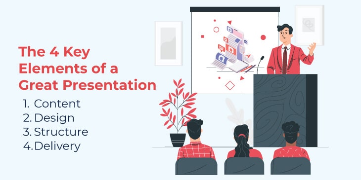
Hygiene, safety, flavor, and presentation are the secrets to pulling all five senses into the experience of eating. The same holds true for presentations. In one of his talks, TED curator Chris Anderson said – “There is no single formula for a great talk, but there is a secret ingredient that all the best ones have in common.” These four ingredients are – content, design, structure, and delivery. And if any of these elements are missing, your presentation will fall flat.
Let’s talk about each element in detail.
1. Content
The content reflects your knowledge of the subject matter. Furthermore, it plays an important role in connecting you with your audience. So, it should be well-researched, genuine, precise, and contextual. With the right data and insights, you can add depth to your presentation, giving your audience a fresh perspective and a new way to approach things.
Some useful tips for a content-rich slideshow:
- Insert only meaningful and important sentences/points relevant to the topic into your slides.
- Ensure that the information you have included in the presentation is gathered from an authentic source and make the audience believe in your idea.
- Explain complex terms and concepts in simple and easy-to-understand language.
- Instead of brimming the slides with too much content, include one central idea per slide.
- Add a title to each slide to make our audience understand what the slide is all about.
- Empower your message and add to its credibility by including testimonials, survey results, and personal experience.
2. Design
Most presenters give more weightage to content than design. Here, it is crucial to understand that you can’t expect a successful presentation if it doesn’t have the perfect balance of content and visuals (diagrams, infographics, charts, graphs, etc.). Think of the content as petrol and visuals as a car; a car can’t be run without petrol and petrol can’t do anything on its own.
The presentation design must be both beautiful and effective; a beautiful design gives a creative look to the slideshow, while an effective design makes your content clear and comprehensible, evoking emotions in the audience and encouraging them to take action.
- Use good quality and high-resolution images that complement and reinforce your message, leaving a lasting impression.
- Use contrasting color palettes for background and text to increase readability.
- Leave enough white space around the text to give it an uncramped look.
- Avoid overusing visuals in your slides, as it will distract the audience instead of engaging them. Include only those visuals that genuinely support your information.
- Keep the style consistent in all the slides. You can also choose custom presentation software which can help you keep your audience attention with well designed, rich media interactive slides
3. Structure
Every presentation has a story behind it with a definite beginning, middle, and end. A well-structured presentation not only enhances the audience’s comprehension but also keeps the speaker stay on the topic.
One structure doesn’t fit well with all presentations; it varies on the basis of the audience’s understanding level, presentation’s objectives, and the key points on which you want to draw maximum attention of the viewers. You can use either less customary organizational patterns or a topical approach to organize your information. You can also create your own structure to arrange content within a sub-topic.
The common presentation structure goes like this – Greeting and introduction, the main body of the talk, conclusion, Q&A session. You can include problem-solution, demonstration, and story in the main body of the speech.
Here is the example of a well-structured presentation by Eric Schmidt, ex-Google CEO, in which he talked about how Google works.
4. Delivery
Let’s go back to your school days. Do you remember a teacher who used to stumble through his/her lectures and whose class you would have bunked many times. The delivery of the lecture might not have had a big focus for that teacher, but as a student, it was a great point for you. Similarly, when it comes to presentation, delivery matters a lot for the audience. A well-delivered presentation makes the audience truly understand and remember your content.
- Pay heed to five distinct vocalics, i.e., pitch, volume, pace, articulation, and pronunciation, while delivering your talk.
- Be conscious of your posture, body language, and gestures while speaking to establish a connection and communicate effectively with the audience.
- In an attempt to be an effective speaker, don’t sound robotic or scripted. Be yourself!
- Use transition phrases and words wisely to smoothly move from one point to another and keep the flow of speech unified.
- Take pause wherever required.
- Allow the audience to participate actively.
Conclusion
The purpose of your presentation is to convey your message to the audience in an impactful manner and make them understand it in the same way as you want, no matter whether you are presenting online or offline. All you need to do is, create your presentation in a simple, clean, and not too fussy manner, including all the key ingredients. Do enough practice to boost your confidence and win over the audience.
Did you find the blog post insightful? Let us know your thoughts with us in the “Comment” section below. And if you like the blog post, do share it on your social media handles.
Follow Techdee for more!


